
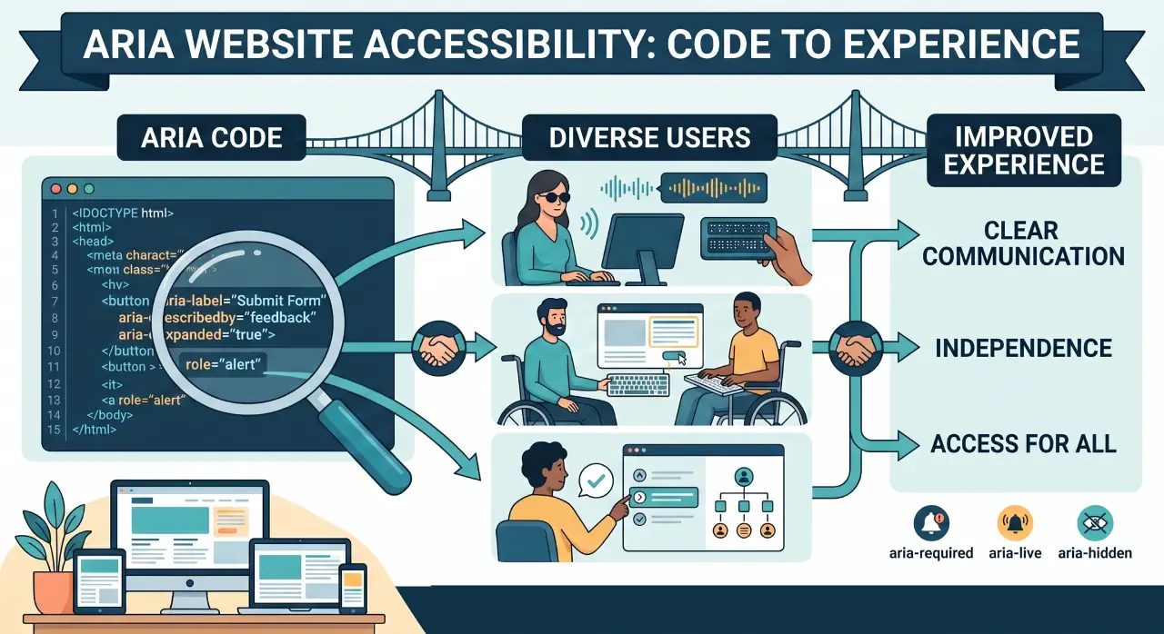

Mastering ARIA Website Accessibility is essential for building inclusive digital experiences that satisfy WCAG compliance. By implementing semantic HTML5 structural elements alongside targeted WAI-ARIA attributes, developers can eliminate functional inference friction for assistive technologies. This comprehensive technical guide provides optimization blueprints, responsive design strategies, and testing workflows to secure logical keyboard tracking focus across complex user interfaces.
Strategic Pillar Context Maps
8 ARIA Tips for Better Website Accessibility
ARIA Website Accessibility is visually appealing, and functional websites is a cornerstone of modern web development. With the rise of dynamic web applications, ensuring accessibility for all users, including those with disabilities, is not just a best practice but a moral and often legal imperative.

Accessible Rich Internet Applications (ARIA), combined with HTML5 and CSS3, empowers developers to craft inclusive digital experiences. This article explores seven essential tips to master ARIA with HTML5 and CSS3, complete with practical code examples, considerations for color blindness, and strategies to enhance accessibility. By the end, you’ll have actionable insights to create stunningly accessible web designs that cater to diverse audiences.
What is ARIA Website Accessibility?
ARIA is a set of attributes developed by the W3C to enhance the accessibility of web content, particularly for users relying on assistive technologies like screen readers. It bridges gaps in HTML where native semantics are insufficient, especially for dynamic content and complex user interface components like sliders, modals, or menus. ARIA attributes, such as role, aria-label, and aria-live, provide additional context to assistive tools, ensuring that users with visual, auditory, or motor impairments can interact with web applications effectively.
HTML5 complements ARIA with semantic elements like <nav>, <main>, and <article>, which inherently improve accessibility by defining the structure and purpose of content. CSS3, with its advanced styling capabilities like flexbox, grid, and animations, ensures that designs are responsive, visually engaging, and adaptable across devices. Together, this trio – ARIA, HTML5, and CSS3 – forms a powerful toolkit for building accessible, modern websites.
Why ARIA Website Accessibility, HTML5, and CSS3 Matter
The web is for everyone, yet many sites remain inaccessible to users with disabilities. According to the World Health Organization, over 1 billion people globally live with some form of disability, including visual impairments like color blindness, which affects approximately 8% of men and 0.5% of women. ARIA Website Accessibility enhances HTML5’s semantic foundation by adding machine-readable context, while CSS3 ensures designs are both aesthetically pleasing and functional. This combination ensures compliance with accessibility standards like the Web Content Accessibility Guidelines (WCAG) 2.1, improves user experience, and can boost SEO by making content more parseable.
1. Leverage Semantic HTML5 as the Foundation
HTML5’s semantic elements provide a strong starting point for accessibility. Tags like <header>, <nav>, <main>, and <footer> convey meaning to both browsers and assistive technologies. Use ARIA only when HTML5 semantics are insufficient, as overuse can confuse screen readers.
Code Example:
<main role="main">
  <h1 aria-label="Welcome to our website">Home</h1>
  <p>Explore our accessible content.</p>
</main>Here, role=”main” reinforces the primary content area, while aria-label provides additional context for screen reader users.
2. Use ARIA Website Accessibility Roles Judiciously
ARIA roles define the purpose of non-standard elements, such as custom buttons or widgets. For instance, role=”button” clarifies that a <div> behaves like a button. Always pair roles with appropriate attributes like aria-label for clarity.
Code Example:
<div role="button" tabindex="0" aria-label="Submit form">Submit</div>
<style>
  [role="button"] {
    background: #007bff;
    color: #fff;
    padding: 10px;
    cursor: pointer;
    display: inline-block;
  }
</style>This custom button is keyboard-accessible (tabindex=”0″) and styled with CSS3 for a polished look.
3. Ensure Keyboard ARIA Website Accessibility
All interactive elements must be navigable via keyboard for users with motor disabilities. Use tabindex=”0″ to make elements focusable and style focus states with CSS3 to provide visual feedback.
Code Example:
[role="button"]:focus, [role="button"]:hover {
  outline: 2px solid #007bff;
  outline-offset: 2px;
  background: #0056b3;
}The outline ensures a clear focus indicator, critical for keyboard users.
4. Design ARIA Website Accessibility for Color Blindness
Color blindness, such as deuteranopia (red-green deficiency), requires careful design. WCAG 2.1 mandates a minimum 4.5:1 contrast ratio for text. Avoid relying solely on color to convey information; use patterns, borders, or text labels instead. Tools like WebAIM’s Contrast Checker can validate your palette.
Code Example:
<nav role="navigation" aria-label="Main menu">
  <ul>
    <li><a href="#home" aria-current="page">Home</a></li>
    <li><a href="#ariat">ARIA Website Accessibility</a></li>
    <li><a href="#contact">Contact</a></li>
  </ul>
</nav>
<style>
  nav {
    display: flex;
    background: #333;
    padding: 10px;
  }
  ul {
    display: flex;
    list-style: none;
    gap: 20px;
  }
  a {
    color: #fff;
    text-decoration: none;
    padding: 8px;
  }
  a[aria-current="page"] {
    border-bottom: 2px solid #007bff;
    background: #555;
  }
</style>The border-bottom and background changes provide non-color-based cues for the active link, aiding color-blind users.
5. Implement aria-live for Dynamic Updates
Dynamic content, like form validation messages or live notifications, must be announced to screen reader users. Use aria-live=”polite” for non-urgent updates or aria-live=”assertive” for critical ones.
Code Example:
<form>
  <input type="text" aria-required="true">
  <div aria-live="polite" id="status">Please enter a valid email.</div>
</form>
<style>
  #status {
    color: #d32f2f;
    margin-top: 5px;
    font-size: 14px;
  }
</style>The aria-live attribute ensures the status message is read aloud when updated.
6. Test with Assistive Technologies
Testing with screen readers like NVDA, VoiceOver, or JAWS is critical to ensure ARIA attributes work as intended. Simulate user interactions to verify that dynamic content, focus management, and navigation are seamless. Browser extensions like WAVE can also identify accessibility issues.
7. Use CSS3 for Responsive, Accessible Design
CSS3’s flexbox and grid create responsive layouts that adapt to various screen sizes, enhancing usability for all users. Ensure styles don’t hide content or break accessibility features, such as focus indicators.
Code Example:
<section role="region" aria-label="Featured content">
  <div class="grid">
    <article>Content 1</article>
    <article>Content 2</article>
  </div>
</section>
<style>
  .grid {
    display: grid;
    grid-template-columns: repeat(auto-fit, minmax(200px, 1fr));
    gap: 20px;
    padding: 20px;
  }
  article {
    background: #f4f4f4;
    padding: 15px;
    border: 1px solid #ccc;
  }
</style>The grid layout ensures content is responsive, while role=”region” and aria-label provide context for screen readers.
8. Additional Considerations for Color Blindness
Beyond high-contrast ratios, consider the following for color blindness:
- Use Patterns or Icons: Instead of color-coded statuses (e.g., red for errors), use icons like checkmarks or crosses.
- Test with Simulators: Tools like Coblis or Chrome’s DevTools color blindness emulator can mimic conditions like protanopia or tritanopia.
- Avoid Problematic Combinations: Red-green or blue-yellow pairings can be indistinguishable for some users. Pair colors with distinct brightness levels.
Example for Color-Blind-Friendly Design:
.error {
  background: #d32f2f;
  border-left: 4px solid #000;
  color: #fff;
  padding: 10px;
}
.success {
  background: #2e7d32;
  border-left: 4px solid #fff;
  color: #fff;
  padding: 10px;
}The border-left provides a non-color cue, distinguishable even for users with color vision deficiencies.
Best Practices for Success
- Keep ARIA Minimal: Use native HTML5 elements where possible to avoid redundancy. For example, don’t add role=”button” to a <button> element.
- Validate with WCAG: Ensure your site meets WCAG 2.1 Level AA standards for accessibility.
- Document Your Code: Comment ARIA usage to help team members understand its purpose.
- Stay Updated: ARIA and WCAG evolve, so follow W3C updates to stay compliant.
Frosted-Glass User Interface Accessibility
If you want to introduce a premium, cutting-edge visual style to your platform without sacrificing usability, deploying a frosted-glass user interface is an exceptional strategy. Best resembling Apple’s iconic liquid glass aesthetic, this modern, high-end user interface trend leverages a translucent foundation to establish a tactile sense of physical depth and structural hierarchy within a digital viewport.
By layering semi-transparent layout containers over vibrant, dynamic backgrounds, it delivers an immersive software experience. If you are ready to modernize your platform while strictly adhering to accessible glassmorphism design parameters
, explore my definitive Glassmorphism Web Design Definition guide. Inside, you can interact with a live prototype component library, audit raw code configurations, and download the production-ready Glassmorphism CSS for free.
Dominate Search on The New Google
Modern search has evolved into a landscape of Answer Engines and autonomous agents. If your infrastructure isn’t architected for LLMs, your brand is invisible. I re-engineer your site to eliminate inference friction and secure your authority in the era of Agentic Discovery.

